Photoshop Tutorial #1: Buh-bye patch! Or, how to avoid streaks by dropping the cloning stamp
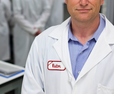 The setup: A fellow photographer friend recently had a job where the client was a bit unprepared for the photo session (how many times has that happened to us?). It was an EP (environmental portrait) of a scientist. The clients wanted him shot in the lab.
 The dilemma: The only lab coat around that would fit him had a red patch that said, "VISITOR." My friend Fred shot away as originally agreed upon. After the fact, however, the clients came back and asked if he could please photoshop out the patch – in a dozen portraits with slightly varying highlights and shadows!
The solution: Now my friend Fred is a super tech-savvy guy (just check out his blog!). He's very well versed in Photoshop's basic editing tools but when it comes to bigger jobs, his comfort level starts to drop. He cloned out the patch in one shot that the client needed up on site right away. But the idea of doing 12 more I think was a bit daunting to him. That's where I came in.
Mighty Mouse: He called me and asked if I were up to the challenge. I said sure without looking at the photos fairly confident I could help him out. Turns out I had a dozen photos to retouch: some with hands crossed over his chest, standing like this one above, more shading over the patch, less shading over the patch, streaked lighting over the patch, etc.
I asked Fred if it was OK to use this as a Photoshop tutorial here and he gladly gave his permission. I've cropped out the subject's face on purpose to protect the client's identity but the overall photo isn't what I'm concerned with here (no disrespect intended Freddie!). It's the retouching I'm concerned with.
A little background, if you please: I started using Photoshop when we got our first Mac in the photo department of the newspaper. We had Photoshop 1.0 loaded on that little LCII. I was one of the first photo lab technicians to play with the program and quickly fell in love with the possibilities.
Cloning stamp, O how I hearted thee: The coolest tool I first fell in love with was the cloning stamp. We were still shooting negative film. And if you've ever worked in a newspaper darkroom, dust-free isn't in our vocabulary. It's about deadlines, not cleanliness. Talk about shell shock! Prior to the newspaper I worked in a pro-lab where everything was about dust-free, smudge free, ABSOLUTELY no cross-contamination, use gloves at all times kind of environment! Anyway, I digress...
Film and dust meant that we lab techs spent a lot of time spotting (and if you're too young to know what spotting is, follow the link.) which costs precious time when you're trying to make deadline. The LCII, a film scanner and Photoshop's clone stamp was, simply put, heaven.
Fast forward: The first tool, my love for the airbrush notwithstanding, to really give the cloning stamp a run for it's money was the spot healing tool. I had a chance to play with it when a friend got Photoshop Elements quite a while back. But Photoshop CS2 saw it introduced to the pro line with much more control. I use it to remove dust left on digital files from dirty sensors with virtually no detection of retouching. Gone is that little streaking that happens when you try to remove something bigger than a small dust spot in a more solidly colored area, such as a sky, using the standard cloning tool. Good tool, the spot healing tool but not my choice for this task. This task involved more of a painting technique and a bit of creative layer sampling.
The steps: (Note: I'm going to assume you aren't a complete novice and have some familiarity with the tools in Photoshop. The lingo, sorry PC users, is Mac-speak.)
First thing I did was to pull guides out from the ruler to define the area.
Using the guides, I took the marquee tool (the horizontal box with the marching ants) with a feather radius of 8 px and drew a horizontal box immediately under the area to be retouched. Then with the marching ants active, I did a command+J to make a new layer from the selection and moved it over the patch. Don't worry about the exposure at this point. First we'll worry about cleaning up the selection, then we'll worry about the blending.
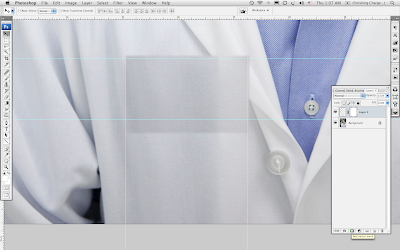
Next, I added a layer mask (click the icon of the gray rectangle with the hole in the middle at the bottom of the layers palette – in the old wet darkroom days, we'd have called that tool a burn card) to the new layer I just created.
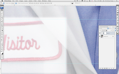
In the pull down menu that generally says "Normal" (near the opacity slider) controls how the layers interact with each other. I change the layer mode from "Normal" to "Screen" which allows me to see the overlap of my new layer on the original (background layer).
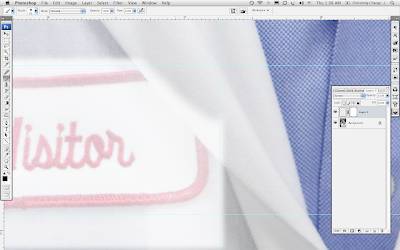
I clicked "D" on the keyboard to make sure that my color swatches defaulted to black and white, picked a soft brush, made sure I had the layer MASK activated and not the actual layer (you can tell which one you have active as the active side will have right angles in each corner around the rectangle that look like mini cropping tools) and with black as my foreground color I started painting away the overlapping area of the new layer. Ultimately, I want to get it down to following the contours, and just slightly bigger, than the red patch.
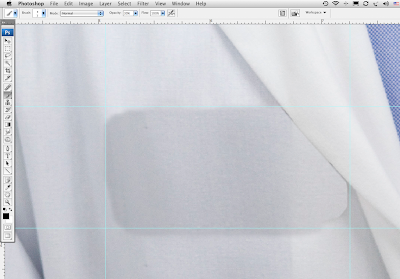
I changed the layer mode back to normal to see my handiwork. To refine the edge of the lapel, I added a new layer and using a small paint brush, sampled the gray of the shadow cast by the lapel, and painted in the an edge and shadow. Use a low opacity on the paint brush setting. Best to build up the layers of "paint" so you have more control than using the brush at 100% and LOOKING LIKE YOU PAINTED A LINE down the edge of the lapel. With an opacity setting of 25%, I was able to simulate the thick / thin shadow with a more natural and organic looking result.

Next I need to tone the new layer (Layer 1). I rarely, if ever, use curves or levels or any of the tonal correction tools DIRECTLY on the main file. I use only adjustment layers as these don't degrade the file. You have more control this way as you can go back into an adjustment layer and decrease or increase its affect without removing information. Once you're happy with the tonal changes you can flatten the layer knowing you're only affecting the pixels once instead of multiple times.
So, I added a Curves adjustment layer but it needs to be "clipped" to Layer 1 so our tonal adjustments don't affect the background layer.
Creating a clipping layer: Click on the adjustment layer icon in the layers palette (the circle that is half white and half black) to bring up the popup menu and select curves. When the curves dialog box pops up, immediately click OK without making any adjustments. Looking at the layers palette, you'll see a Curves layer immediately above your Layer 1.
Now comes the "clipping" part. Holding the option key, hover over the layers slowly moving up and down between the two layers and you'll notice the pointing finger change to two stacked circles that intersect as soon as you get to the line that separates the two layers. When you see the intersecting circles, click your mouse. Violà! You've just clipped the curves adjustment layer to Layer 1.
You'll notice that the curves layer is slightly to the right and there is a little arrow pointing down towards Layer 1. Layer 1 now has an underline indicating it's the base layer to the clipping group. Now when you make changes to the curves, you're ONLY affecting the dark layer 1 and you'll be able to see when it comes into the tonal range of the rest of your photo.
And because this is an adjustment layer, when double-click on the graph icon of the curves adjustment layer, the curves dialog box reopens allowing you to make your tonal changes.

See red patch.

See red patch gone.
After getting the basic tonal adjustment to my satisfaction, I flattened the file then used the dodge and burn tools to "paint" the highlights and shadows up and down the left side, helping to blend the patched area into the background. Use a low opacity setting, change between the mid-tones and highlights setting of the tools often and vary your brush size in order to fine tune the adjustments. Remember, a few passes are better than a single botched pass, especially since you are working on the base file. And since there is an exception to nearly every rule, this is one of the few I have to making tonal adjustment directly on a file. It's a spot treatment and I try to keep it to a minimum.
By using this method for larger areas, you keep the manipulation of individual pixels to a minimum making the retouched area look more organic and detection harder.
Fred said he blew all the retouched files up too 100% and couldn't find any pixels out of place to indicate where the red Visitor's patch originally had been.
Fine praise indeed.
Here's another before and after using this technique:


Comments
Post a Comment