INSPIRATION: Sharing an award-winning illustration, step by step
For a few weeks now, I've been consumed with reorganizing my home studio in order to accommodate my new iMac and my renewed focus to stay creative (Stay tuned for pictures and chatter! Same bat channel but another bat time…).
In doing so, I had a load of "stuff" to wade through and get rid of. You know, I've most definitely inherited that artist gene that doesn't want to throw anything away because I never know if I might want to incorporate it into a project some day…Do all artist have it or did I just inherit that from my own artist mom??? Seriously, I have loads of stuff for projects waiting to be started, started projects waiting to be finished, finished projects waiting to be promoted in order to find new homes.
But that's another post too. I digress… Back to the originally scheduled program:
In the course of wading, I came upon notes from a workshop I gave back in 2002 on Fine Art Illustration and Keeping the Creative Spirit Alive. I thought I'd break some of the parts out, update them a bit and share some of it with all of you.
Today, I'm sharing the part where I walked everyone through my creative process by re-building one of my illustrations. I was honored to be asked to be the illustrator for a week-long in-depth series we did at the San Diego Union-Tribune following the aftermath of back-to-back shooting sprees at local high schools.
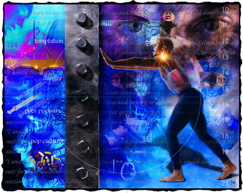
As a photo editor at the time, the senior editor of visuals approached me and asked that I take this on. They needed three anchor illustrations the first of which was to appear in our science section in a story dissecting the male adolescent brain and how it handles strong emotion, particularly anger. The second was to appear in our family section on how important it was for us to teach our children how to love themselves so that they become confident and grounded and, therefore, less prone to peer pressure.
The last illustration (entitled "Forgiveness") was to go with a wrap up think piece in our Currents section written by our Religion & Ethics editor on guiding parents through the grieving process following such a horrific tragedy. I also was responsible for creating themed icons that would appear throughout the newspaper during the weeklong series. It was quite an undertaking and although the prompt was horrific, the experience of focusing so intensely in such a short time period on a project of this magnitude had a profound impact on me at a very crucial point in my creative journey as an artist. Especially considering that the conceptualization was entirely on my shoulders and I was given carte blanche to run with my ideas.
So here is a quick, down and dirty walk through of the process of creating this illustration in Photoshop. The model was a friend of mine who graciously agreed to model for me. And you can tell this was a while back as the screen shots have a rainbow Apple logo and it's Photoshop 6! Holy moly! OK, here we go:
THE FINISHED ILLUSTRATION:
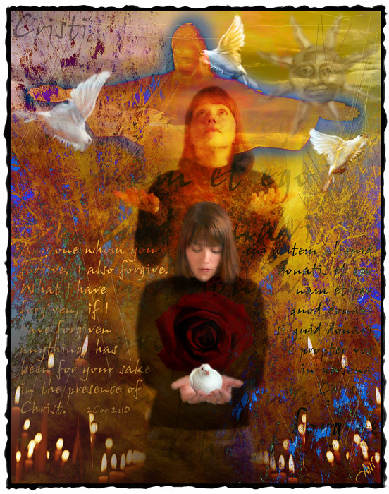
THE PIECES: I used 11 photographs and a bible verse. Some of the photographs I shot specifically for this project, some were from the UT archives by fellow photographers and some were from my collection of stock art CDs.

THE STEPS:
 1. I always start with my backgrounds. Often I paint them traditionally onto canvas or a masonite board that I've treated with gesso then scan them into Photoshop. Other times, like in this particular instance, I’ll pull from my archive of photographs and manipulate the textures or color palette to give me the look I want for the particular project on tap. If you notice, I cloned out the screws that were in the center of the frame. Then I added the first appearance of a type layer with the latin version of 2 Corinthians 2:10 (a passage that speaks to forgiveness): "Any one whom you forgive, I also forgive. What I have forgiven if I have forgiven anything, has been for your sake in the presence of Christ."
 2. I then brought in the clouds changing the layer mode to luminosity which allowed me to downplay the blue sky and keep the sky consistent with my chosen color palette. I added a gradient mask to keep the clouds confined to the natural sky area of my composition and blended it into my background. I then duplicated the cloud layer to build up it’s density and used the airbrush tool to make some areas more transparent than others. I then added a second type layer with the latin word for Christ in the upper left hand corner (in "luminosity" mode) that would mirror the later added word forgive in the lower right hand corner.
 3. Christ the Redeemer, the famous statue in Rio was added in "difference" mode. Difference mode is not quite the same as a straight inverse of positive to negative. The difference mode is semi-transparent allowing the colors to be affected by the colors in the layer directly below it. The halo around Christ was created by my conscious decision to not use the pen tool to select the statue from it’s original background. Instead I used the eraser in airbrush mode to paint away the sky. I accentuated the effect by duplicating the file and selectively manipulating the brightness and contrast. (Note: I use a Wacom tablet with a stylus pen. When you attach a graphics tablet to your computer, several hidden palettes are then activated in Photoshop that help you mimic real painting and natural media and give you virtually infinite control over blending and layer transparency.)
 4. Next I added the candles in "lighten" mode. I duplicated the file and flopped it so they would go across the bottom of the illustration. I masked out the center overlap to allow for the later placement of the main figure of the woman. Lighten mode blocks the shadow to lower mid-tones in the active layer allowing only the highlights to upper midtones to be visible. Darken mode has the opposite affect.
 5. The sun was brought in, blurred and cut back to 50% opacity. Next came the rose. First layer was in normal mode at 35% opacity and duplicated with the second layer being blurred and changed to hard light mode which compressed the tonal scale.
 6. The second appearance of 2Cor 2:10 was brought in but this time in English.
 7. The latin version of the passage was brought in to mirror the english. Type was changed to white and a shadow added for dimension.
 8. I added the tree in difference mode with a gradient layer mask using the stylus to selectively airbrush away sections of it. I wanted the trees to be subtle…almost indistinguishable. I like to add as much organic imagery as possible to keep the illustration textured and filled with some "background noise" to keep the final image from looking cold or flat as can often be the look and feel of computer generated art.
 9. I duplicated the tree layer and flipped it upside down. I added a blank layer and using the pencil scratched lines through it to add more noise to the background.
 10. I brought in the woman twice, first in a hard light mode at about a 50% opacity and then again in darken mode with a gaussian glow filter applied to soften the image and help achieve the ghostlike quality I was after.
 11. I turned off the eyes for the woman looking up layers to hide them while I worked on the main image of the woman looking down. I brought the image in twice the first in normal mode at 35% opacity to give some definition to her form. The copy was changed to hard light and a gaussian glow blur applied to give her a more painterly look.
 12. I turned the looking up layers back on. I then added a layer of just the models face looking down in normal mode at a half opacity to give me an outline base to paint on.
 13. I added a blank layer and using the stylus pen in airbrush mode, I picked up colors from the swatches palette and painted in details to her face, hands and hair. This helps blur the line between photo and painting and the figure then begins to glow. I added an adjustment layer to pop some contrast into the shadow areas around her face.
 14. Next came the doves.
 15. I used the same dove in flight for all three applying the free transform and skewing, flipping and distorting them to make it look like different birds caught in flight.
 16. To finish, I flattened the image then I duplicated the flattened layer. I enlarged the canvas and turned off the eye for the copied layer. I picked a brush from the palette that looked like a sponge and painted in the black border. Last I turned the eye back on for the image layer and flattened the file again. The base file was 28.6MB. The working file had 35 layers and reached 332.4mb.
Ok, so there you have it: A bit of a peek into how my brain works during my creative process. My series of illustrations for this project that year swept first, second and third place in the San Diego Press Club awards, Society of Professional Journalists San Diego Chapter, helped me win Best Illustration Portfolio in the Copley Ring of Truth awards, and placed in the Society of Newspaper Designers for Features. This particular image was the first place winner in those contests.
This one that went with the family piece was second:

And this one that went with the science story was third:
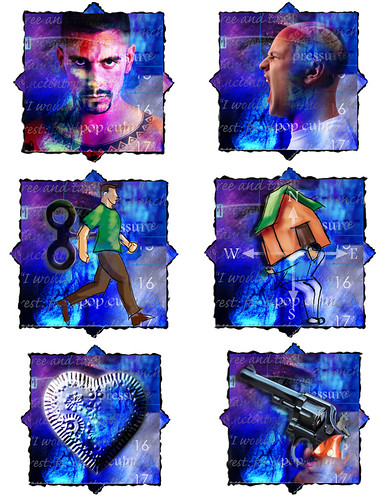
Here are some of the themed icons that ran daily throughout the week:
YOUR TURN: Do you hold onto stuff "just in case?" And when do you finally let go of it?
Keep that creative spirit alive! Remember, "Creativity comes from trust. Trust your instincts…" ~ Rita Mae Brown
Until next time,
Ani
In doing so, I had a load of "stuff" to wade through and get rid of. You know, I've most definitely inherited that artist gene that doesn't want to throw anything away because I never know if I might want to incorporate it into a project some day…Do all artist have it or did I just inherit that from my own artist mom??? Seriously, I have loads of stuff for projects waiting to be started, started projects waiting to be finished, finished projects waiting to be promoted in order to find new homes.
But that's another post too. I digress… Back to the originally scheduled program:
In the course of wading, I came upon notes from a workshop I gave back in 2002 on Fine Art Illustration and Keeping the Creative Spirit Alive. I thought I'd break some of the parts out, update them a bit and share some of it with all of you.
Today, I'm sharing the part where I walked everyone through my creative process by re-building one of my illustrations. I was honored to be asked to be the illustrator for a week-long in-depth series we did at the San Diego Union-Tribune following the aftermath of back-to-back shooting sprees at local high schools.
As a photo editor at the time, the senior editor of visuals approached me and asked that I take this on. They needed three anchor illustrations the first of which was to appear in our science section in a story dissecting the male adolescent brain and how it handles strong emotion, particularly anger. The second was to appear in our family section on how important it was for us to teach our children how to love themselves so that they become confident and grounded and, therefore, less prone to peer pressure.
The last illustration (entitled "Forgiveness") was to go with a wrap up think piece in our Currents section written by our Religion & Ethics editor on guiding parents through the grieving process following such a horrific tragedy. I also was responsible for creating themed icons that would appear throughout the newspaper during the weeklong series. It was quite an undertaking and although the prompt was horrific, the experience of focusing so intensely in such a short time period on a project of this magnitude had a profound impact on me at a very crucial point in my creative journey as an artist. Especially considering that the conceptualization was entirely on my shoulders and I was given carte blanche to run with my ideas.
So here is a quick, down and dirty walk through of the process of creating this illustration in Photoshop. The model was a friend of mine who graciously agreed to model for me. And you can tell this was a while back as the screen shots have a rainbow Apple logo and it's Photoshop 6! Holy moly! OK, here we go:
THE FINISHED ILLUSTRATION:
THE PIECES: I used 11 photographs and a bible verse. Some of the photographs I shot specifically for this project, some were from the UT archives by fellow photographers and some were from my collection of stock art CDs.

THE STEPS:


Ok, so there you have it: A bit of a peek into how my brain works during my creative process. My series of illustrations for this project that year swept first, second and third place in the San Diego Press Club awards, Society of Professional Journalists San Diego Chapter, helped me win Best Illustration Portfolio in the Copley Ring of Truth awards, and placed in the Society of Newspaper Designers for Features. This particular image was the first place winner in those contests.
This one that went with the family piece was second:
And this one that went with the science story was third:
Here are some of the themed icons that ran daily throughout the week:
YOUR TURN: Do you hold onto stuff "just in case?" And when do you finally let go of it?
Keep that creative spirit alive! Remember, "Creativity comes from trust. Trust your instincts…" ~ Rita Mae Brown
Until next time,
Ani


Comments
Post a Comment